

An identity to support HBC
HBC is an accounting and consulting firm based in Quebec. It needed a brand identity and graphic guidelines to bring consistency to all its materials.
The identity needed to convey the firm’s rigour and reliability while remaining approachable and human. It also needed to unite its accounting and consulting activities through a shared visual language.
From an olive tree to a brand symbol
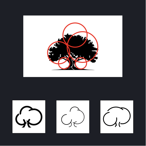
The olive tree was the client’s initial suggestion. In this exploration, it evokes strength, longevity and productivity: ideas that echo the stability and growth of the businesses HBC supports.
The tree drawing explores two readings: the H takes shape in the trunk, the B in the curves of the foliage on the right and the C in those on the left. The initials become part of the tree itself.
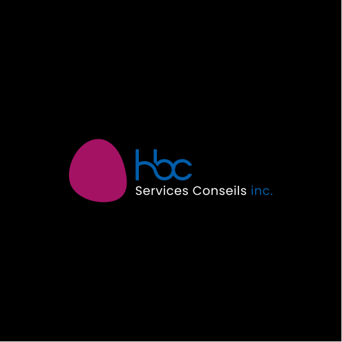
Trials and discussions with the client gradually led to a simpler expression: a flowing monogram paired with an organic shape suggesting an olive. I carried out all the research and design developments shown below.


01 — The tree and the initialsAn initial direction combines the olive tree’s silhouette with the letters HBC.
02 — The monogramThe curves are simplified into a continuous, more legible symbol.
03 — The organic shapeA shape suggesting an olive accompanies the monogram.
Brand architecture
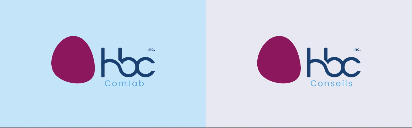
HBC Comtab and HBC Conseils share the same symbol and monogram. The activity name distinguishes the two signatures while preserving a common identity.
Typography
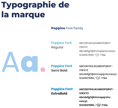
The Poppins family supports the identity in three weights: Regular, SemiBold and ExtraBold. They establish a hierarchy within the content while maintaining a consistent expression.
Colours
Dark magenta and ink blue form the core identity. Greys and lighter shades complete the palette, offering variety in compositions and backgrounds.
Let’s build an identity that feels like you.
From shaping your positioning to creating your communication materials, I offer advice and hands-on support to build a consistent, distinctive, lasting visual identity.
Let’s discuss your project →An identity that works with photography
The full signature, the logo without its descriptor and the standalone icon offer three levels of presence. White versions contrast with photographic backgrounds, while colour blocks extend the brand’s visual language.



From the monogram to the graphic pattern
The pattern extends the logo’s design. Its curves become modular elements: repeated on a grid, then developed into coloured fragments to create a shared graphic language across HBC’s materials.
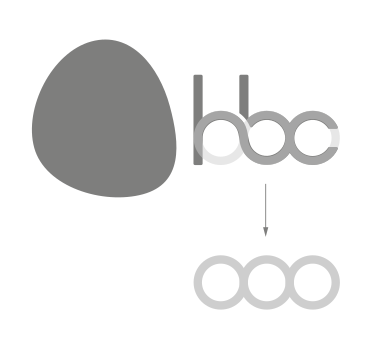
The logo’s curves
The circular shapes of the monogram provide the starting point.

The construction grid
Repeating the circles creates a grid that structures the pattern.
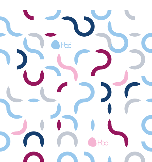
The coloured pattern
Selected fragments of curves are coloured to compose the pattern.
The pattern in use
These mockups show how the pattern can shape a space: alongside the logo in a corridor, or on a reception wall.
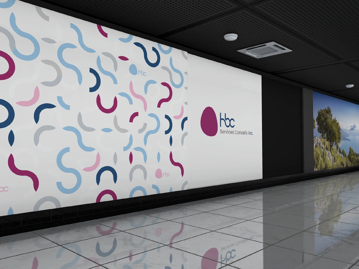
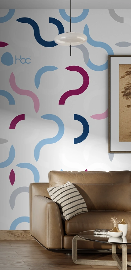
Identity mockups illustrating possible applications of the pattern.
A flexible pattern to support the brand
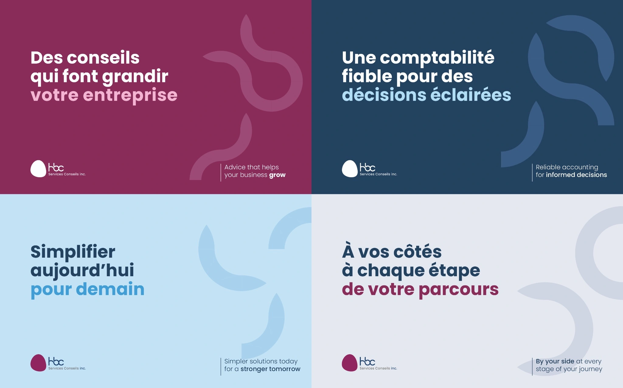
The graphic pattern created for HBC adapts flexibly across the brand’s materials. Its elements can be used individually or combined, as backgrounds or accents, with variations in size, colour and arrangement. This flexibility allows compositions to evolve while maintaining a consistent visual identity.
The four visuals below illustrate possible posts for LinkedIn and social media. They show how the pattern can support different accounting and consulting messages while retaining the brand’s visual cues.
The business card
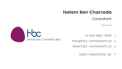
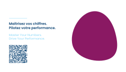
The front presents contact details in a clear composition. On the back, the message and organic shape give the identity a more expressive presence.

Structuring documents
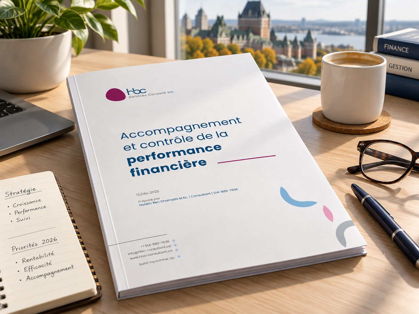
The cover of the “Accompagnement et contrôle de la performance financière” report uses the identity’s visual cues: the logo, a clear title hierarchy, colours and pattern elements. A spacious composition makes the information readable and connects the document to HBC’s graphic universe.
Guidelines to extend the identity
The guidelines bring together logo versions, colours, typography and pattern principles. They serve as a reference for developing new materials while maintaining brand consistency.
Research, identity design and brand guidelines, with regular meetings and discussions with the client.