After more than 20 years in design, I still enjoy sharing my experience just as much. Passing on knowledge to students matters deeply to me, whether they study law, biology, science, business, computing or design.
Every discipline has its own knowledge and methods. Yet all offer opportunities to present ideas: a talk, a dissertation defense, a report, a scientific poster or a group project.
That is why I encourage students from every discipline to explore design fundamentals. Learning to organize information and communicate it visually can help you share what you have learned more effectively.
Today, another question arises: if artificial intelligence can generate images and suggest layouts, why learn to create your own materials?
Give your ideas a clear visual form
You know your subject. Your audience may be discovering it for the first time. How can you help them follow your reasoning and remember the key points?
Design begins with these questions: what is the main idea? In what order should the information appear? Which elements deserve emphasis?
A title sets the direction. Subheadings structure the reasoning. A diagram can support an explanation. Space helps separate elements.
This process also encourages you to clarify your thinking. If a slide becomes overcrowded, you may need to rethink the message before looking for a better layout.

Applications in your discipline
In law, a diagram can help explain the stages of a procedure and the deadlines involved. A table can make it easier to compare provisions while preserving their nuances.
In biology, an illustration can explain a process or relationships between elements. Labels, colors and positioning should support understanding and scientific accuracy.
In business, a presentation can guide an audience from a problem through analysis to a proposal. A well-designed chart helps readers understand data without distorting it.
In computing, a diagram, interface or documentation can become clearer through consistent visual organization.
In literature and the humanities, a map, timeline or document layout can support an analysis and make its structure easier to follow.
Whatever your discipline, the aim is the same: help others understand your work.


As a student, can you rely entirely on AI to create your visuals?
AI can help you explore ideas, prepare an illustration or suggest an initial layout. But delegating visual creation does not remove the need to understand and check the result.
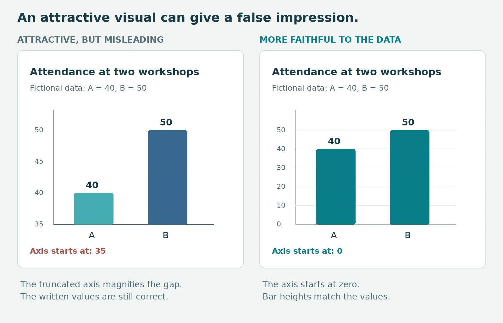
An image that looks convincing at first glance is not necessarily accurate, relevant or easy to understand.
For your university work, ask yourself:
- Does the visual correctly represent the concept being studied?
- Are the text, labels and data accurate?
- Can the sources be identified and checked?
- Is the material readable in the conditions in which it will be presented?
- Can you explain every element and justify its presence?
A biology diagram must accurately represent the process it explains. A legal illustration must match the concept being presented. A chart must remain faithful to the data.
You can use AI, but you remain responsible for what you present. Also check your institution’s rules on its use and how to acknowledge it.
Learning design fundamentals helps you write clearer requests, evaluate suggestions and improve them. Your judgment remains essential, even when the tool does much of the work.
A few fundamentals can already improve your materials
You do not need to master a suite of software to get started. You can apply simple principles with the tools you already use.
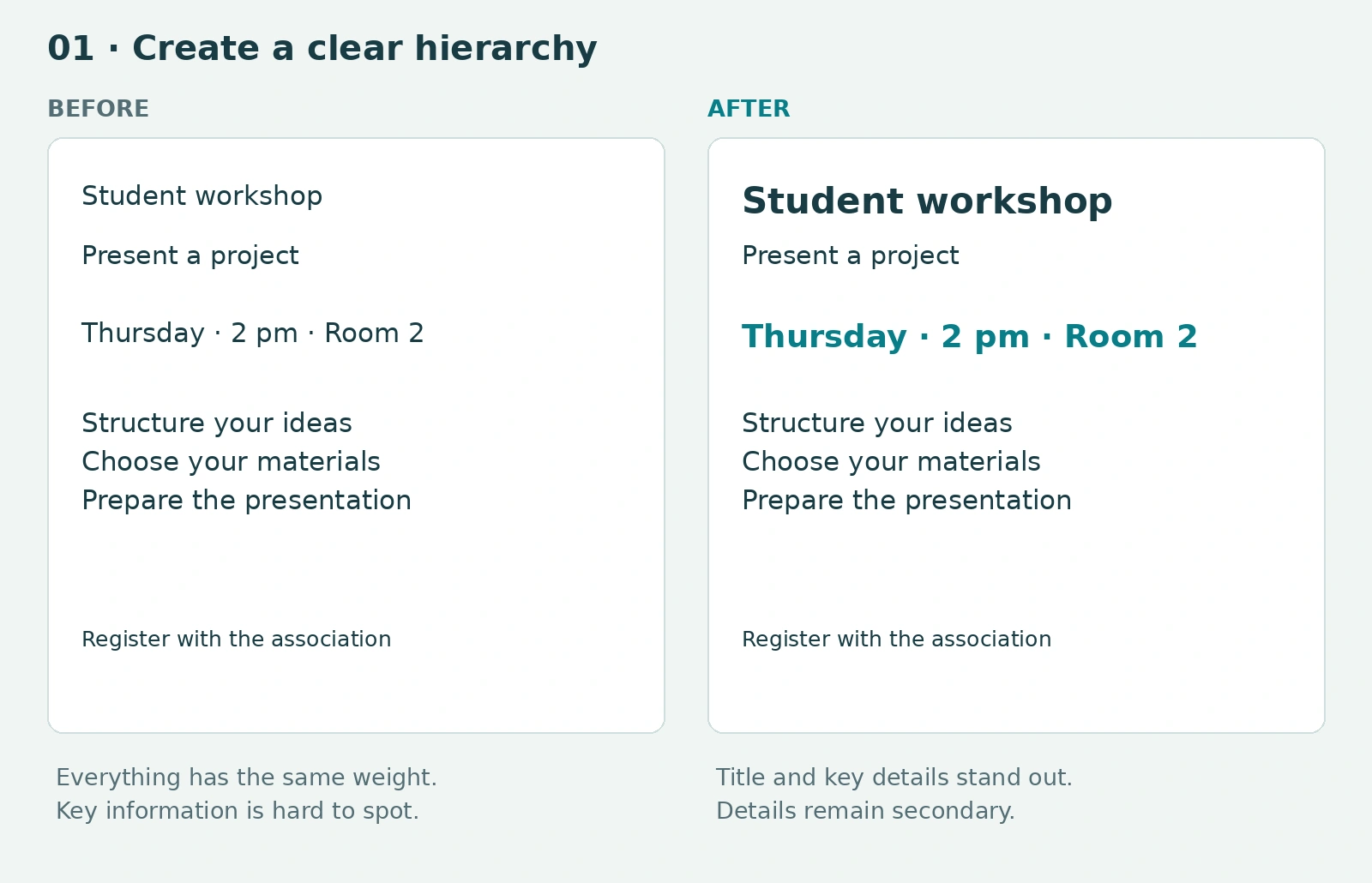
Create a clear information hierarchy
Distinguish the title, main ideas and details. Your reader should quickly recognize what matters.
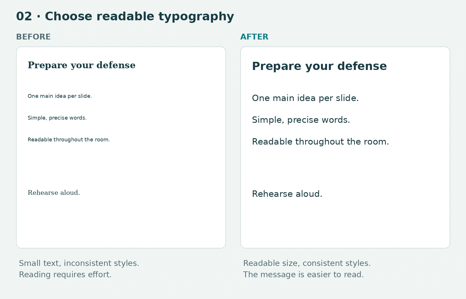
Choose readable typography
Limit the number of fonts and adapt text sizes to the medium. A projected slide should be readable from the back of the room.
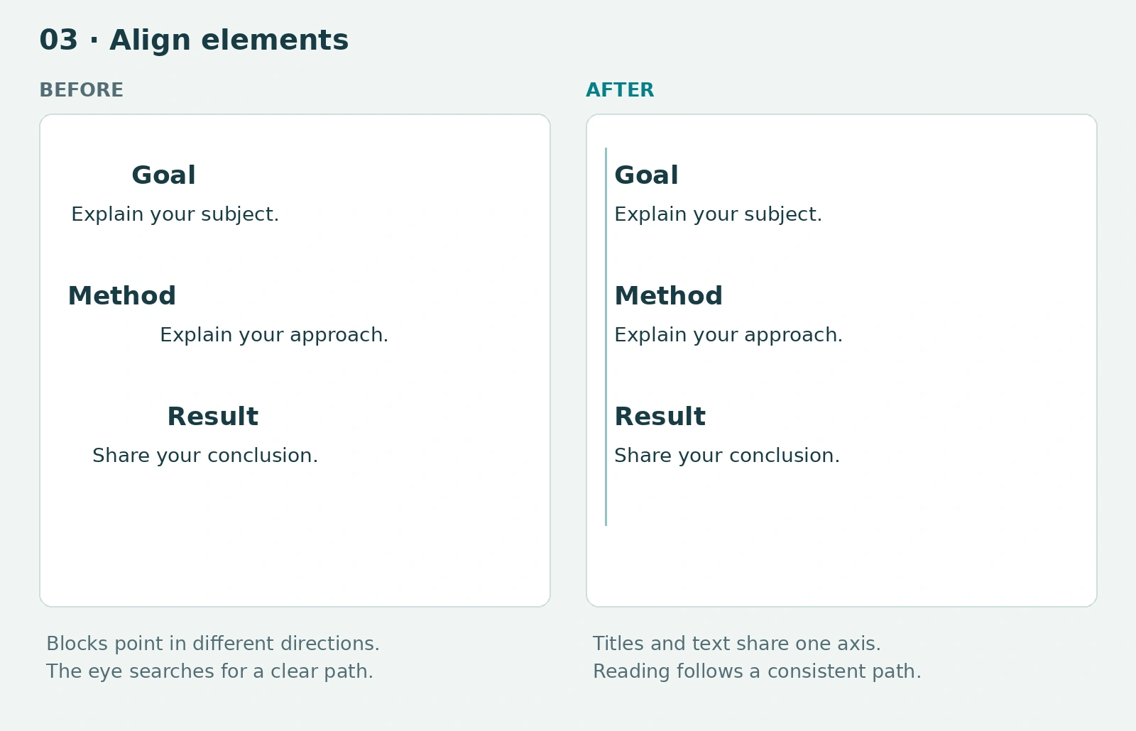
Align elements
Give text, images and labels a consistent structure. Regular alignment makes reading easier.
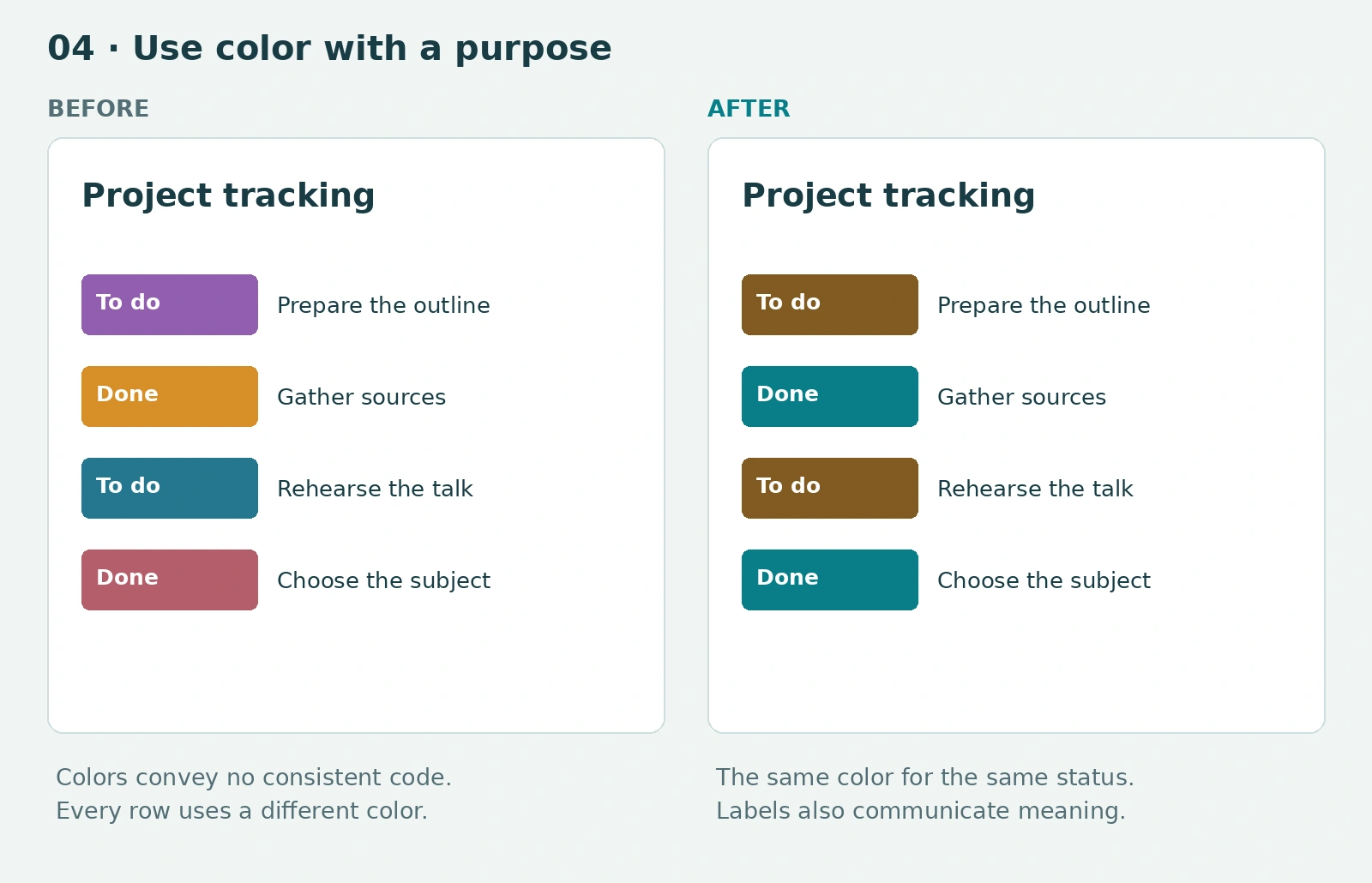
Use color with a purpose
Use colors to highlight, group or distinguish information. Add text or symbols when their meaning matters.
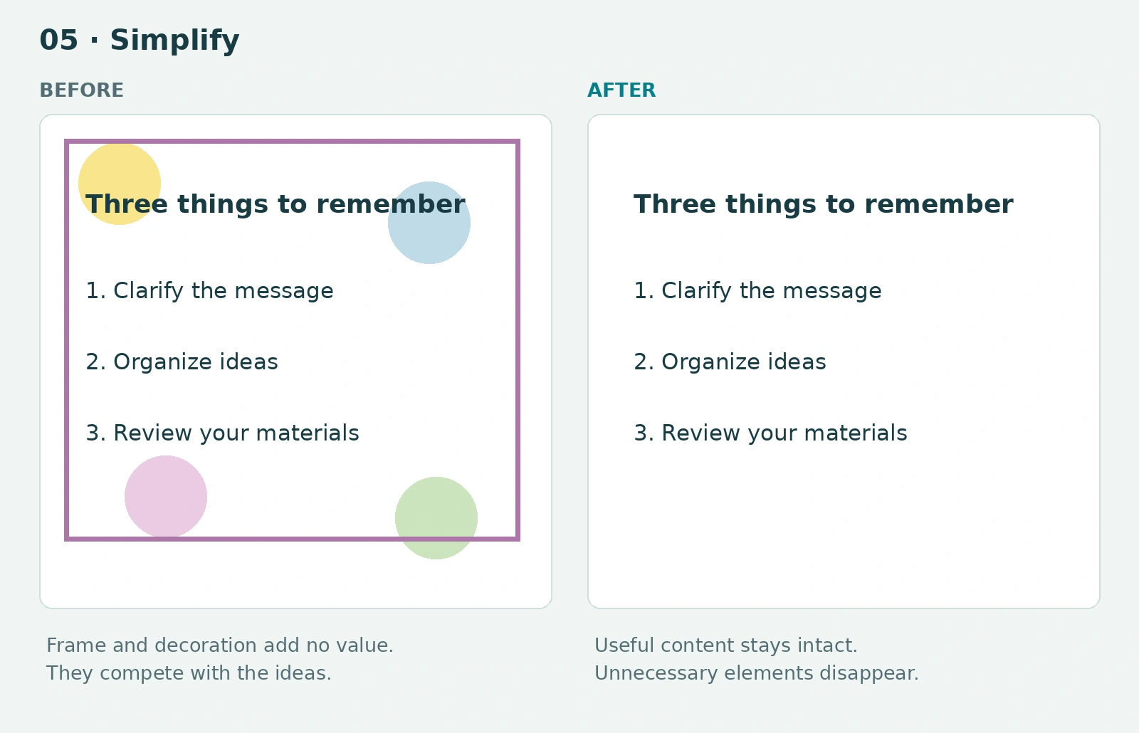
Simplify
Remove elements that distract attention. Every image, effect or decoration should have a reason to be there.
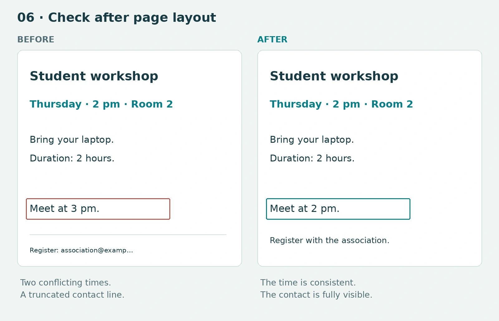
Check after laying out the page
Review the data, sources and labels. Make sure their placement clearly shows what they refer to.
A ready-made template can help you get started. Take time to adapt it: a talk, dissertation and scientific poster have different requirements.
Develop your visual judgment and independence
Learning design also means learning to look carefully.
Why is this document pleasant to read? Why does this presentation seem confusing? Which element catches your eye first? Is it the one that should matter most?
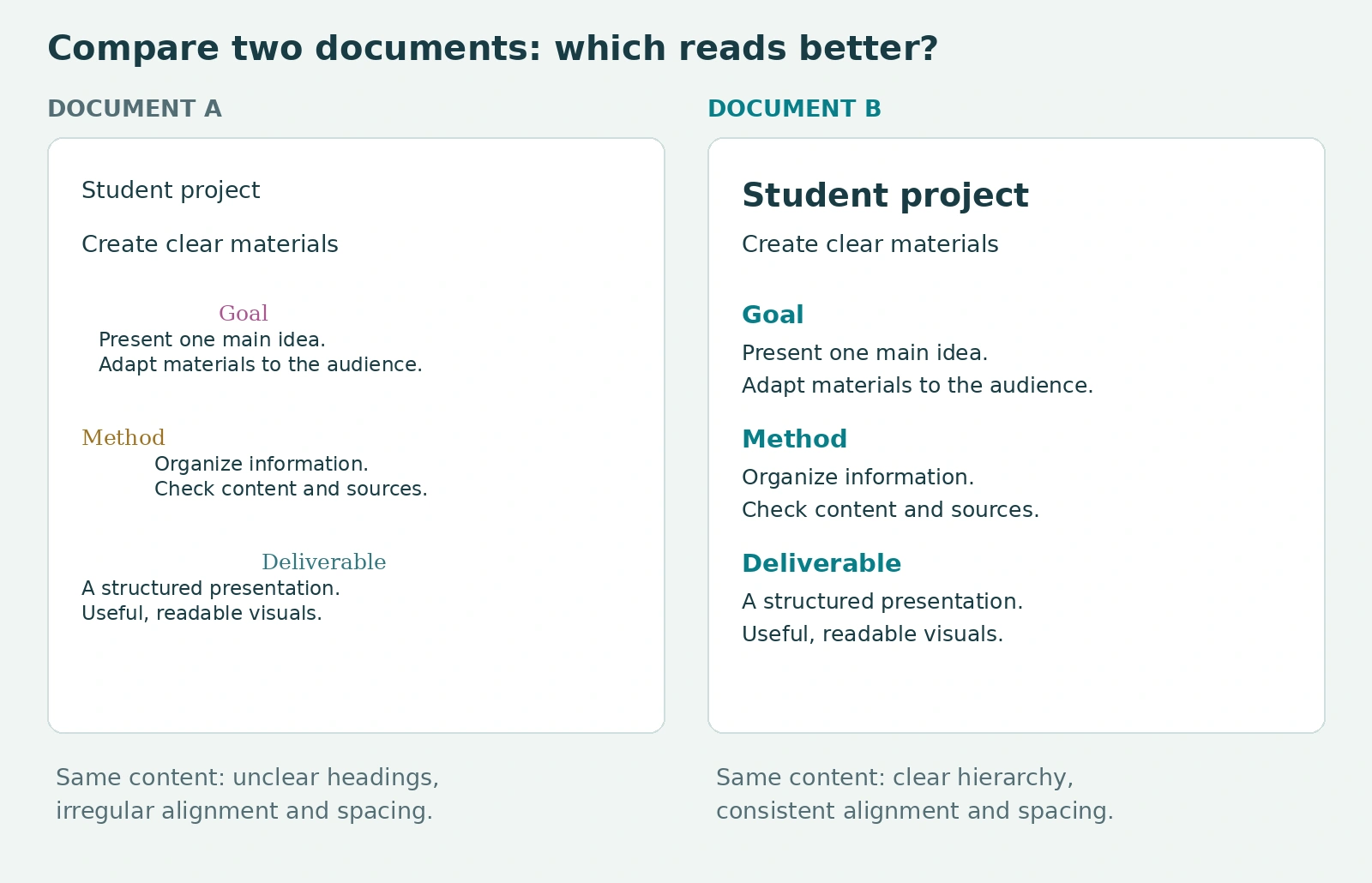
By observing and comparing, you learn to explain your choices. You become more independent in improving your materials, using available tools and working with a professional when your project calls for it.
You do not need to want to become a graphic designer to develop these skills. They can support your university studies and the situations in which you will present and defend your ideas afterwards.
Student clubs: let’s organize your next training session
Would your club like to offer its members an activity that supports their studies and club life? Design training can help them prepare better presentations, create materials for events and communicate their initiatives.
Together, we can build a session suited to your members: a practical workshop using their own materials, or a themed masterclass exploring an approach through examples and demonstrations.
Topics can include presentation layouts, event poster design, visual communication fundamentals or using AI with a critical eye.
Do you represent a student club or association? Contact me to plan your next design training session or masterclass. Tell me your preferred topic, the number of participants, their level and the proposed dates.
Organize training for my club →